Our Offices
USA OFFICE
937, Shore Point Court, # G313,
Alameda - 94501, California, USA.
INDIA OFFICE
C - 81C, Sector - 8,
Noida 201301, UP

Ever since their emergence, pop-ups have been seen as nothing more than a nuisance. With time, pop-ups have managed to gather enough hate in the hearts of people that various tools have surfaced in an attempt to get rid of them. This dissatisfaction linked to pop-ups might be because of the fact that they are used to bombard the visitor each time they visit a website.
Many of us fail to realize is that there are specific parameters that can be set to restrict the number of pop-ups to stop them from becoming so annoying. For example, if a pop-up appears just once for each visitor through use of cookies, it is much more likely to yield better results.
The ultimate challenge is to use pop-ups in a certain way that does not compromise on the user experience or causes many complaints. While you cannot please each and everyone, there are methods in which you can use pop-ups to enhance the number of conversions without compromising your website’s user experience.
Let us review four distinct ways in which pop-ups can be used to improve conversion rates without annoying your users.
Entry pop-ups are probably the most disturbing type of pop-ups. They appear whenever a visitor first enters a site. The significantly degrade the user experience by interrupting the reading and browsing flow. They spoil your visitors’ experience right from the moment they come to your website.
As an alternate to entry pop-ups, you should consider using exit pop-ups. These appear when your visitor is leaving the website; therefore, they do not hamper the browsing and reading flow.
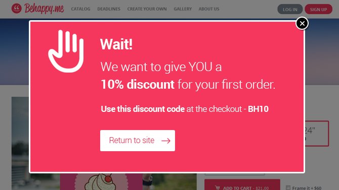
When it seems that a visitor is about to leave the site, exit pop-ups can show up to encourage the visitors to stay connected with the website. Check the example of Behappy.me:

This exit pop-up appears when a user indicates behavior of leaving the website.
Another reason people have nurtured hate for pop-ups is because many of them do not contain any valuable or relevant content. If your pop-up contains content that is valuable for the visitor because it helps them solve their problem, find a solution, or answers their question, it would not be considered as annoying.
As a matter of fact, pop-ups with relevant and valuable information are considered helpful and are liked by visitors.
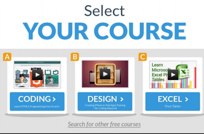
One way of using pop-ups is to use it as a supplemental navigation tool. In place of using pop-ups to promote a product/offer or a subscription, use a pop-up on your site to redirect traffic to appropriate areas. For instance, you could forward your visitors to the most-sought after content to help increase conversions altogether while enhancing user experience. One good example is as follows:

This pop-up acts as a navigation menu, directing users to relevant sections of the website.
Each of your visitors will come to your website from different sources, and will have varying needs and goals that they want to fulfill. Some might be interested in different types of products or solutions; therefore, each person will respond in a different manner to your marketing messages.
In order to enhance user experience and make your pop-ups more ‘likeable’, you must tailor your marketing messages for different types of audiences and groups of customers.
When the message fits the needs of a specific group, you are more likely to experience better growth with regards to your conversion goals.
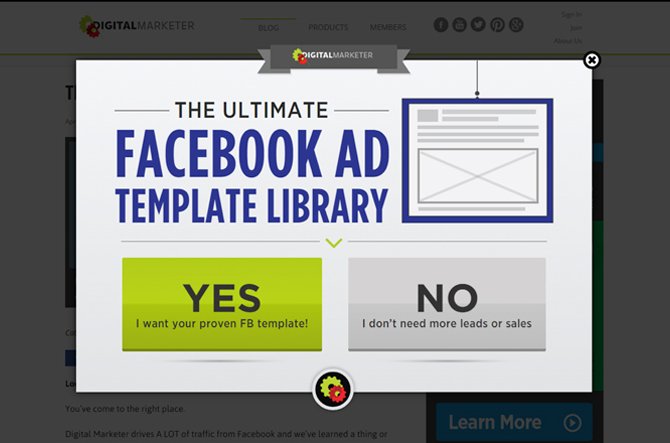
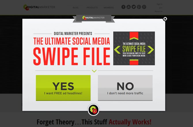
At the core of digital marketing, you will find that highly customized messaging has an immensely strong role to play in determining the success of your marketing campaigns and efforts. The same should be applied to your pop-up campaigns to ensure they are as relevant to your customers as possible. Digital Marketer makes excellent use of this.
They display the following to those users who show interest in Facebook marketing:

For those people who show a general interest in social media marketing, the following pop-up is shown:

The result of this personalization would be: improved rate of conversions and enhanced user experience.
It is important to perform A/B testing to determine which pop-ups are useful for your website and which ones are harmful. The same types of improvements as those for traditional A/B testing are now available for website pop-up campaigns. You can increase your conversions with A/B test by as much as 40 percent – that too while improving the overall user experience of the visitors.
This testing will enable you to identify the messages and design elements that work and those which don’t, while telling you what should stay and what must be removed.
A/B testing can also reveal some valuable analytics, including the following:
Conclusion
To sum it all up:
A lot of website owners find themselves struggling to reveal sufficient, valuable information without getting to the point when their attempts become distracting to the visitors. Worried about spoiling user experience, many simply quit using pop-ups.
However, it is a proven fact that if you use your pop-ups correctly, you will be able to convert a higher number of visitors into leads, signups, and sales without compromising on your website’s user experience.
Subscription Implies Consent To Our privacy Policy
7 Reasons Why Internet Marketing Is Important For Your Business
The 10 Advantages of Using WordPress for Developing Business Website