Our Offices
USA OFFICE
937, Shore Point Court, # G313,
Alameda - 94501, California, USA.
INDIA OFFICE
C - 81C, Sector - 8,
Noida 201301, UP

 With exponential germination of newer devices, varied platforms and latest desktop and mobile-specific browsers, it has become indispensable for every business owner to ensure their websites render perfectly irrespective of the device being used by the audience. With mobile browsing gaining hype everywhere, it is imperative to mould the website structure in a way that it delivers all the important information, products and news easily and effectively.
Thus, clients tend to hire responsible website designers who are well versed with the newest tools and techniques that let websites adopt finger-friendly strategy, magnetize visitors and convert them subsequently. While conventional design approach requires one to create a separate web design per device, responsive designs ease the task by detecting screen resolutions smartly and adjusting their layouts accordingly, thereby, catering to the audience with Mobile-First approach. Imagine how soothing it is to see your web design layout adapting to the viewing environment (the browser) and responding to every screen resolution (the device) flawlessly. So, fasten your belts and dive into the following article to join us on a ride that gives Life To Your Designs.
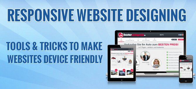
Responsive website designing (RWD) is a technology that refers to crafting of websites in a manner that gives optimal viewing experience, hassle free readability and smooth navigational charm along with minimal resizing and scrolling on multitude of devices. Not just this, a responsive site lets you –
RWD technology uses a mixture of following two approaches.
1. Your First Weapon to Quick Project Development – BOOTSTRAP

Bootstrap is an open source module based front end framework which was introduced by Twitter in August 2011 and soon became the most popular GitHub Development Project in 2012. It’s latest version Bootstrap 3.0 supports responsive design and comes with the following basic modules and re-usable components that are a pre-requisite in every website design.
Not just this, the toolkit also comes bundled with some JQuery Plugins (Dojo Bootstrap), a few controls to support UI Bootstrap (Angular Js) and an exclusive stylesheet Less.css that lets you organize your style codes, cascade them and speed up your UI development even more.
2. Your Website is in WordPress?? Skeleton is the Solution !!
Skeleton is a framework based on a simple 960px grid system that comes bundled with a collection of stylesheets to help you build responsive websites quickly and rapidly. Not only this, it offers you an exclusive extension for WordPress called Skeleton Plus which is a WordPress theme that helps one to design simply beautiful mobile-friendly websites on the most popular content management system-Wordpress.
Major features of Skeleton-:
3. Test Your Website On “Screenfly” Tool Before Going Live
With so many devices and varied browsers in hype, it becomes difficult to test your design fitting pretty well on every screen size. For this, you probably need a testing tool to quickly get an idea as to how your website will deliver on major gadgets and multiple browser windows. Screenfly is a responsive emulator by ”QuirkTools” that helps you waive off all your worries by allowing you to test your design on a plethora of devices absolutely free of cost. Just visit their site http://quirktools.com/screenfly/, enter your web address and choose amongst 27 different devices including 2 Netbooks, 2 Notebooks, 5 different Desktops, 6 Tablets, 9 major Mobile Phones and 3 TV screen resolutions on both portrait and landscape mode. Not just this, there is an option to let you define your own custom screen size right at the top and apply it to check how your website renders on that particular resolution. Amazing, isn’t it??
The First Trick – Define your Breakpoints clearly
There are 6 major breakpoints that you should not forget to define if you want to have a responsive layout for your site. Accomplish all this using CSS Media Queries .
 Target the first generation smartphones in Portrait Mode with a CSS rule that corresponds to Resolutions less than 480 px
USE the CSS Code-:@media screen and (max-width:480px) and (orientation:portrait)
 Target the high-end smartphones and iPads in portrait mode with a Resolutions less than 768 px
USE the CSS Code-:@media screen and (max-width:768px) and (orientation:portrait)
 Target giant tablets and mid-sized laptops with separate style for Resolution greater than 768 px.
USE the CSS Code-@media screen and (min-width:768px) and (orientation:landscape)
 Target Low Resolution traditionally used Mobile phones with a style for Resolutions less than 320 px.
USE the CSS Code-:@media screen and (max-width:320px)
 TargetiPads and Big Tablets in landscape mode by defining style for Resolutions more than 768px but less than 1024 px
USE the CSS Code-:@media screen and (min-width:768px) and (max-width:1024px)
 Target widely designed desktops with a style for Resolution greater than 1024 px
USE the CSS Code-:@media screen and (min-width:1024px)
You must use Flexible containers to make your layouts adapt quickly to every screen size. Flexible Grids use –
To accomplish this, we recommend using Grid based Frameworks that lets you use a separate style sheet to make the task quicker and easier.
Some of the best Grid Systems available for free include-
Just Wrap a specifically styled div with the layout div in case you want to have custom visual styles on your flexible container element that is defining the responsive layout.
By this we mean, you should make your Graphic Media( images and videos) actually behave and respond to every screen size as well as browser window. As a conventional approach, many of us are still in a habit to set absolute widths and fixed heights for our images which makes them inflexible and thus deliver ugly on most of the devices. As an RWD process, inflexible images have to be converted to flexible to make them actually respond to changing device and browser environment. To simply adjust your width (Adaptive Sizing Technique), use the style attribute- img {width:100%}. Variable Breakpoints clubbed with media queries can also be used for alternate pictures if you don’t have any problem with the Bandwidth usage.
The switching from pixel based layouts to percentage layouts is indeed the most critical aspect in RWD process. There are so many small and large design elements in a website that it becomes really challenging to bang over the head with nested %age layouts(%age inside %age) unless you are a calculation nerd and still ending up madly frustrated with everything cluttered across the screen. For this, we recommend you to
Last , but not the least, we will strongly advise novices to gain sufficient knowledge on Responsive Web Designing Technology to have a pressure-less and hassle-free experience on all your forthcoming projects. Enjoy your site on all devices and drive your audience crazy keeping all the tools and tricks handy!!
Subscription Implies Consent To Our privacy Policy
7 Reasons Why Internet Marketing Is Important For Your Business
The 10 Advantages of Using WordPress for Developing Business Website