Our Offices
USA OFFICE
937, Shore Point Court, # G313,
Alameda - 94501, California, USA.
INDIA OFFICE
C - 81C, Sector - 8,
Noida 201301, UP


Responsive web design is the practice of creating websites that display evenly on all devices as the design adjusts itself automatically as per the screen size of the user i.e. whether desktop or mobile. While the Internet has brought globalization across the world, mobile growth has also picked explosive growth in the recent years taking mobile internet usage to remarkably higher levels. The growth of mobile internet usage has surpassed the use of Internet over desktop and laptops, thus forcing the developers to know about the trending term “Responsive Web Design”.
Although there are numerous definitions of responsive web design available over internet, but I will explain here one of the most general definition of this new term.
“Responsive web design is a design approach that is aimed at developing websites suitable to work on all types of devices, which have different screen sizes such as mobile phones, tablets, and kindle fires. ”
A good question to answer, and for getting the accurate answer we have to go back in the dark days of mobile internet when it had not been so much popular and majority of the websites was served via a technology called “Wireless Application Protocol”. Moreover, the browsers on mobile phones and tablets were limited in terms of bandwidth, standard compatibility and CSS. Hence, the need for a technique of adapting a website’s layout to a device’s display arises.

The urge of having this technique was first written by Cameron Adams in 2004 but the term “Responsive Web Design” was coined by Ethane Marcotte in May 2010 in his “A List Apart” article. The complete theory and practices concerning to this new technology of developing websites was explained by Ethane Marcotte in his book named as “Responsive Web Design”.
The vital difference that separates responsive design from other web development approaches is its focus on including breakpoints in the website design instead of targeting different devices.
If you are developing a responsive web design, you must adhere to the key principles of this technique, which are listed as follows:
Consisting of a series of rows and columns, the fluid grid systems convey order and consistency in a responsive website design. They present an organizational framework to help in creating the order in which the information needs to be presented over the site. This organizational framework makes it easier for the visitors to follow the information conveniently and get what they are searching for.
For example, a website might have 3 columns next to each other in the desktop version, but in mobile versions, these columns will become narrower and hence, it is better to present these columns in stacked format over a mobile screen requiring the user to scroll the web page to see the content.
An example of a responsive website with the fluid grid system is given as follows:

On desktop and tablet view, the “Quick Links” and “Global Projects” is placed next to each other while on the mobile screen, the latest news takes the entire width of the screen while the Global Projects and Quick Links are located below, which can be accessed by scrolling down the web page.
Prioritizing the most relevant information and fields such as vital content for both visitors and site owners is important for devising strategic responsive design. You need to take care of the content while designing your website through the responsive technique as it plays a major role in making your website searchable over the popular search engines.
The perfect example of a responsive website design, which sticks to its priorities is the US President Barack Obama’s website:

When the width of the site narrows, the “DONATE” button comes at front-and-center along with “Log in” and “Create Account” buttons while the “Email” and ZIP“ buttons forms the left over points. Impressively placed, the “THE VERY LATEST” option tops up a list of easy-to-tap links. The pictures are prominent over the site with central calls to actions remain unaffected.
Do you know that most of the websites get 25% traffic through mobile while 75 % traffic through desktops? But then also, responsive web design is becoming increasingly popular, why? Your approach should be focused on desktop visitors first.
While this logic is used in website design but logically, if we design the website as per desktop configuration, we might end up putting a lot of features and functionalities in our website, which are otherwise unnecessary for the mobile users since they wouldn’t be able to access those features on their smartphone browsers. With mobile first viewpoint, we begin loading the complete bare necessities on smaller platforms, which leads to a better website viewing experience that avoids needless lag.
Considered as a set of modern techniques and tools, responsive web design aims to rearrange the way information is displayed according to the device capabilities. The key to this technique is response, which means procuring information about the devices, react and show an adapted version of the website.
The basics of a responsive web design include the following points:
Media queries are simple filters, which are executed in the CSS styles. They help in changing the styles easily depending on the characteristics of the device rendering the content, consisting of the display width, height, type, resolution and orientation.
You can place all the styles which are required for printing within a print media query like this:
< link rel=”stylesheet” href=”print.css” media=”print”>
Moreover, you can apply the media queries in two other ways that can be easily embedded in a CSS file:
@import and @media.
For performance, any of the two methods are preferred over the @import syntax as this:
@media print {
/* print style sheets go here */
}
@import url(print.css) print;
You can also implement media queries depending on the viewport sizes.
The syntax of media queries, which can be executed depending on the device configurations is:
@media (query) {
/* CSS Rules used when query matches */
}
It might sound boring, but keeping your site’s layout simple is the first thing to execute while developing a responsive website. Try to keep your HTML coding simple and clean and don’t apply too much tricky code like CSS3 special effects or JavaScript for designing the critical parts of the website’s layout.
Use flexible grids while building a responsive website because flexible grids uses columns for organizing the content and offers relative instead of fixed width for adapting the viewport size. Fluid layout is the best way to get adept to different screen sizes and orientations.
The website of Dusty Cartridge is the perfect example of fluid grid systems:

The viewport meta tag changes the behavior of a mobile browser by altering the “virtual viewpoint” of any device. The virtual viewpoint is the view of a mobile screen, which is different from the default view. Hence, it is called as virtual viewpoint. It allows the screens to have definite zoom behaviors.
The code snippet used in a responsive template is given as follows:
This code snippet tells the mobile phones not to zoom and also allows the responsive template of mobile devices to be loaded in the scripts.
Here is the table explaining the Meta Tag Viewpoint properties:
| Width | The width of the virtual viewport of the device. |
| Device-width | The physical width of the device’s screen. |
| Initial-scale | The initial zoom when visiting the page. 1.0 does not zoom. |
| Minimum-scale | The minimum amount the visitor can zoom on the page. 1.0 does not zoom. |
| Height | The height of the “virtual viewport” of the device. |
| Device-height | The physical height of the device’s screen. |
| Maximum -scale | The maximum amount the visitor can zoom on the page. 1.0 does not zoom. |
| User-scalable | Allows the device to zoom in and out. Values are yes or no. |
There are numerous patterns used in Responsive web designing. However, the most important patterns used in this technique include:
This is the most popular pattern used in responsive web design and is perhaps most simple as well. This pattern consists of a multi-column layout, which introduces bigger margins on huge screens and relies on fluid grids and pictures to scale from huge screens down to small screens.
The biggest benefit of using this pattern is it usually needs one breakpoint between the large and small screens.
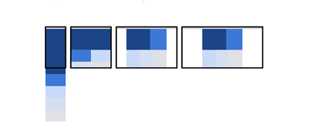
It is another popular pattern of responsive web design, which comes with a multi-column layout and closes with a single column layout, dropping the columns along the way as the screen sizes become smaller.

However, unlike the Mostly Fluid pattern, the general size of elements in this pattern stays consistent.
This responsive web design pattern does the most when it comes to adapting according to varying screen sizes, which means different layouts are used on different screen sizes.

Although it requires a little more effort than the Mostly Fluid and Column Drop patterns, yet it is implemented on most of the responsively designed web sites.
This pattern has the simplest form of adaptation and are used by those businesses, which prefer the simplicity of web pages within a single column layout. It works well with single column layouts like text heavy articles and one page linear website.

For those who are bequeathed with the such simplicity, multi-device adaptation can just be few tiny tweaks to image layout and font sizes.
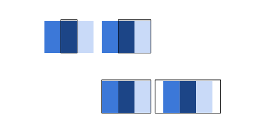
Instead of stacking the content vertically, the off canvas pattern puts less frequently used content, including the app menus and navigation off screen and displays them only when the screen size is big enough. In this pattern, the content is just a click away on small screens.
Here I am going to list some websites, which have successfully implemented the responsive design on their websites.
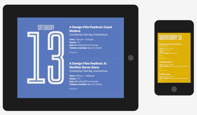
Incorporated from beginning to end by Portland design, Design Week Portland truly represents the meaning of “fully realized” since, the complete layout is young, authentic and supports the conference’s ability as an authority of a remarkable design.
2. The Next Web
We cannot forget to talk about the responsive design without conceding the platform, which presents the work. The Next Web uses a notable responsive design layout that looks good on all screen sizes.

3. A Book Apart
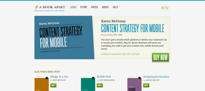
A List Apart is an exclusive example of responsive website that takes full advantage of this amazing technique. The layout of this website manages to maintain an orderly display system for products.
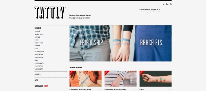
4. Tattly
Tattooing company Tattle uses the flexible layout to create a strong impression among its clientele without being cliché.
The website of Harvard University embraced the responsive design without loosing its decades of reputation by using the longstanding aesthetic of the University. It is the best example of the difference between design and layout.

6. Time
With an aim to give all the readers the same viewing experience, the famous news portal Time intelligently incorporates the responsive layout in its design to make its website readable and minimal to the readers.

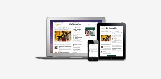
7. Boston Globe
This news corporation paid subscription service has understood the importance of responsive web design. The layout of this website comfortably adjusts itself to varying screen sizes, offering an exceptional reading experience to the readers.
8. Notre Dame
The college’s in-house development team has impressively executed the use of responsive design layout in its website, which highlights strong graphics and elements with minimized navigation bar.

Typically, Google supports three configuration types for smartphone’s optimized websites:
Responsive Web Design is growing in popularity at a very fast pace and in the imminent days, almost all websites have to use this latest technique on their websites if they really want to succeed in this competitive marketplace. Your online business success will definitely get a major boost if you cover both desktop users and mobile users because in the coming years, the mobile internet usage is surely going to leave behind the desktop internet usage. So, you can hire skilled responsive web designers for getting finest responsive design services at industry best price.
Subscription Implies Consent To Our privacy Policy
7 Reasons Why Internet Marketing Is Important For Your Business
The 10 Advantages of Using WordPress for Developing Business Website