Our Offices
USA OFFICE
937, Shore Point Court, # G313,
Alameda - 94501, California, USA.
INDIA OFFICE
C - 81C, Sector - 8,
Noida 201301, UP


The mobile landscape is quickly spanning its roots worldwide. As per the statistics from two separate Gartner’s reports, smartphones sales crossed a billion mark in 2013 alone and mobile is on the verge of becoming a 20.6 billion dollar market by 2015. In fact, mobile commerce precisely m-commerce, has become a completely different domain as most of the E commerce websites claim more than 60% of their traffic via mobile. In such a scenario, if you miss to have a mobile version of your website, you are likely to lose 90% of your traffic to your competitors. Even a 1 second delay in mobile page load time equals a flat 7% loss in conversions. It is therefore imperative to pay heed to Mobile UX Optimization and rethink the design paradigm from user’s point of view by sprucing up your web designs specifically for mobiles. However, understanding good Mobile UX, mapping the psychology of the target visitors, and implementing the best tactics to build a user friendly relationship is a hard nut to crack. So, in this article of mine I decided to help you out by throwing light on the usability aspects and share some tips with you that will definitely prove fruitful for you to deliver high performance user experiences on mobile devices and will subsequently boost your website’s engagement on the hottest gadgets – smart phones and tablets.
There are people who are still living with the fallacy that mobile web designs are just the smaller versions of desktops and by just going responsive; they will offer an exclusive user experience on mobile gadgets too. However, the scenario is altogether different. Trust me, you are likely to run into a plethora of usability issues if you miss on correct Mobile UX Optimization.
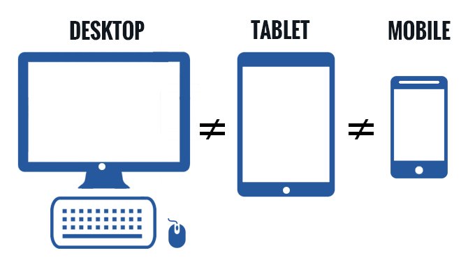
Shrinking the big web designs to fit the small screen deliberately is not the key solution to a successful mobile web design. There’s more to it and it is the size and behaviour of the usable area that needs to be understood, the interaction with the front end that needs to be comfortable under the thumbs and fingers, the touch screen gestures (tap, flick, swipe) that should not turn up being the pain points or flaws of your design. Don’t kill the UX factor dramatically from your designs and accept the fact that the desktop is not like your tablet or mobile and vice a versa. You will have to follow a User Centred Approach while designing for mobile and for this you need to stop treating mobiles and tablets as desktops or laptops and dump the misconception that a responsive UI guarantees a fantastic UX. Instead, a perfectly mobile optimized responsive UI that offers hassle free interactivity from user’s point of view is what that will let your web design engage visitors and win the hearts of your clients.

Now, let’s see the drastic difference between the responsive yet non optimized UX mobile web design and a completely mobile optimized UX design through an example image shown below. The first one is just a small and shrinked version of a desktop site while the other one is a separately optimized mobile site to specifically cater to the mobile audience.

The input mechanisms of Mobile are absolutely different from those of desktops. I have jotted down the most important considerations below –
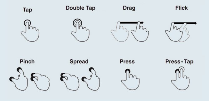
a) There is no physical mouse in your tablet or smart phone like in a desktop. Your web design is displayed and being interacted via the touch screen that works both as the mouse and the display screen. Plus, there are no hover or rollover states when it comes to mobile. Clicks and navigation gestures are totally different. Like in mobile you have gestures like “swipe to scroll”, “pinch to zoom in and out”, “tap”, “flick” etc. I have included an image below to help you understand these gestures and their functionalities better.

So, build your mobile web design in such a way that it doesn’t hinder easy interactivity and can support all the essential features.
b) Study the minimum and maximum sizes of the normal human “finger” and “thumb” and use your common sense while designing buttons or widgets that are to be included in your mobile web design. Keep some extra padding or space between two design elements so as to avoid navigation to a wrong page. Craft all your small buttons with at least 44×44 px dimensions so that they are easily accessible via touch gestures.
The core 3 constituents of a mobile web design that is perfect from UX perspective includes – Well structured Information Design, Simplified Navigation Design and a highly interactive User Interface Design. For a successful mobile web design that delivers high performance User Experiences, it is imperative that website developers start their Mobile UX optimization plan by sketching wireframes.
According to Usability.gov, a wireframe is a visual illustration of a Web page. It’s simply meant to illustrate the features, content and links that need to appear on a page so that your design team can mock up a visual interface and your programmers understand the page features and how they are supposed to work. One of the main purposes of a wireframe is to show you where each item should be placed on a page.
Typically, wireframes represent the skeletal framework of a web design in a 3D view with the sole purpose of arranging all the content and create a complete blueprint of the mobile screen. Wireframes are necessary because the rough 2D diagrams don’t work best most of the time and it is necessary to use 3D stencils to come up with something that is best when emulated live on the wide range of mobile screens. Below I have included an image to help you understand better. Here you can see 3 different wireframes of a web design.
When these wireframes start offering interactivity, they become a product that is tested and finally transforms to a Prototype. So basically Prototypes are functional wireframes and when a mobile web design is to be tested for Mobile UX Optimization, experienced web design agencies create at least 3 prototypes of a web design and experiment various scenarios to finalise the one that goes live in the end. Both wireframes and prototypes are the critical elements of a successful Mobile UX Optimization Strategy to help you save the re-designing costs and the re-building efforts.
To ease the mobile wire framing task for you, I have included the best 3 tools below. These 3 tools are rated top by Uxmag.com and are written in the descending order of their ratings. So I would suggest you to get your hands on at least the one that suits best to your requirements.
a) HotGloo – HotGloo is a very lightweight template like system that lets you design full page layouts on its canvas. The best part about this tool is that it offers a powerful responsive interactivity that flawlessly adapts to different screen resolutions.
b) Protoshare – This tool is built on a JQuery Engine which lets you design high level mobile web designs by manipulating the design hierarchy and including east to drag and drop features. This tool is technically very robust and is recommended to the developers who are expert in JavaScript and HTML 5.
c) Mockflow – Mockflow is a snappy web based interface that stands out amongst others due to its fantastic responsive point-and-click User Interface that enables you to build mobile specific webpages amazingly faster.
Due to multiple no of mobile devices and platforms (iPhone,Blackberry, Windows Phone, Android Phones), it is extremely important to go through the latest UI guidelines and get familiar with the latest Human Interface resources to craft tactics to tailor the design patterns in sync with the specific UI of each device. So here I am listing the resources along with the hyperlinks so that you don’t fizzle on the web to look for them.
Last, but not the least, I would like to mention that the key to deliver a truly mobile optimized user experience is critical from business perspective because this is what that can either skyrocket your ROI or hurt it to the core. It’s high time you “Go mobile” in real sense and hire experienced web developers to quickly have a mobile-makeover of your site. Take action on the desktop versions of your websites before it’s too late to save your online presence. Your visitors have gone mobile and now it’s your turn to outreach to them with an amazing mobile website.
Subscription Implies Consent To Our privacy Policy
7 Reasons Why Internet Marketing Is Important For Your Business
The 10 Advantages of Using WordPress for Developing Business Website