Our Offices
USA OFFICE
937, Shore Point Court, # G313,
Alameda - 94501, California, USA.
INDIA OFFICE
C - 81C, Sector - 8,
Noida 201301, UP


“A logo does not only give your brand a visual identity but it also performs the functions of elaborating your brand’s personality, making it visually memorable, marketing your products globally and persuading different groups and sectors of society to not only buy but also become your loyal customers.”
Successful logo designs like Nike, GAP, and FedEx define the elements of success as simplicity, attractiveness, and easy to remember. It is not difficult to make your logo stand out in a crowd of millions of logos. You only need to spend more time in brainstorming and conceiving the concept and spend lesser time in over-designing a company logo. Even if you are an amateur logo designer, who wants to win over the experienced designers in online project markets like Freelancer, the following tips to avoid mistakes while designing a company logo can be your professional partner.
Since almost a decade, brand marketing has expanded its wings from print and electronic media to social media. Your company logo design needs to perfectly fit in the frame of HDTV as well as different screen sizes of mobile phones. Many logo designers commonly use raster graphics and bitmaps which lose quality when zoomed in orpixilated.
Tip– Use vector graphics to design the first sketch for easier editing and screen friendly zooming. Use scalable vector graphics and embed the logo designs into the web pages using HTML5.
When working with fonts, you need to choose the simplest logo designing techniques. Over-designed typefaces not only make the logo look confusing but it also miss the factors of brand persona. To play with fonts, it is essential to keep the information of company, its operations, public brand image, space usage, and overall design look in mind. Another common mistake with fonts and typeface logos is the use of more than two font types in one logo.

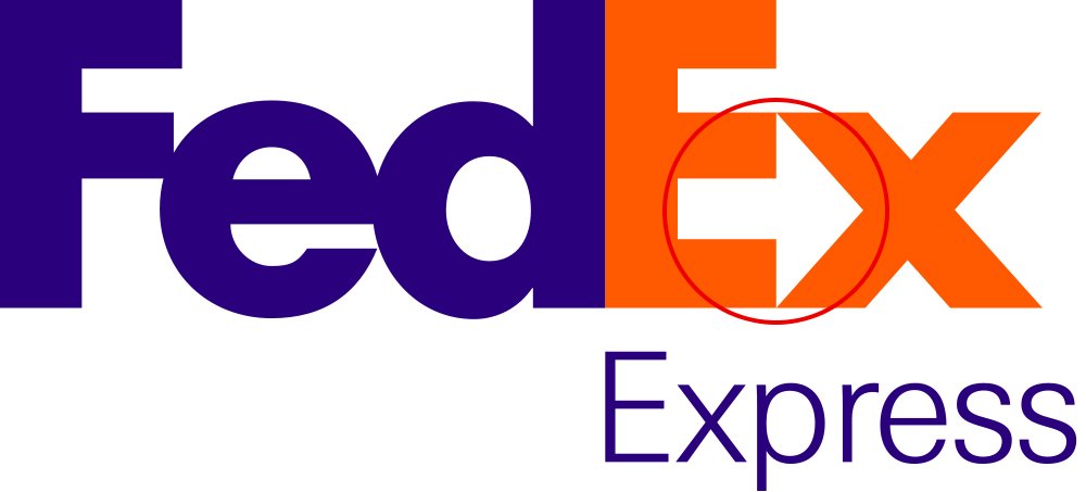
Tip– Take the example of FedEx. The designer has used the two basic colors in single font and generated the ‘feel of company operations’ by making a visually catchy ‘arrow’ between E and X. If you want to work with more than one font in a logo, then use different shades of one color or single shade of same color. Working with more than two fonts is generally not favorable unless the purpose of logo is to show the company’s diversity. But make sure that you choose vision-friendly combinations of fonts.
 A company logo should be easy to reproduce, leave an instant impact and must be simply enough to memorize. As a general rule, the logo designers should avoid using pictures, images, and sketches in the logo to avoid complexity. However, there are some examples of famous brands like Starbucks and Kentucky Fried Chicken which have image carrying logos. These brands gained fame from their trend-setting products, and not the logos, during the times of least saturated markets. To stand out in the saturated capital market, it is vital to design a simpler logo.
Tip – Instead of imitating the successful brands, spend more time doing research on the company information and business to conceive a relevant logo design.
 When you want to choose only one color for your company logo, it is important to consider the meaning of the color. For example, blue is the color of loyalty and mostly used for corporate logos. Orange is the color of freshness and liveliness, and it is mostly used in the logos of fruit juice brands. But orange is also used with pink and green color for clothing series of female and children. When you want to choose more than one or two colors for your logo, then consider the overall look of the color contrast rather than the dictionary meaning of individual colors.
Tip- A perfect logo is the one which is free from color dependency. Design your company logo in the black and white and add colors in the end so that the color can be changed for redefining the brand later on or introducing a new range of products and services.
A majority of the beginner logo designers use stockart images in their logos which kill the uniqueness of logo and company’s brand personality. Some business owners also design their logos on their own to save money and choose the shortcut of stock art for designing a company logo. The biggest problem with stock art images is of copyright infringement and violation of intellectual property laws. You not only lose your logo but also lose company’s reputation.
Tip–Make freehand sketches using paper and pencil while keeping the company information in mind. Closely review the sketches and find out the best workable sketch to redefine the company features in your unique logo.
A person wearing red shoes cannot stand out from the crowd of people wearing red shoes. Trends look better in the fashion industry only. For establishing a long-lasting brand identity, it is vital to design a logo that visually promises quality and describes the company’s vision and mission statements.
Tip – Define and elaborate the features and promises of the brand. Pick 1 to 3 features and promises and then design a company logo. If they don’t work out together, choose other features and promises. Incorporating all features in one logo will complicate the visual appearance of the logo.
In order to avoid complex logo designs, many designers choose literal logos that look like illustrations and drawings. Even if you want it to be extra literal, yet you can add a hint of brand identity in the logo, for example, Families logo.
Tip – Remember three rules when designing a company logo; simple, memorable and unique.
Logo designing is a diverse art which can make or break a brand identity. Challenge your creativity and don’t fear trying out new ideas. Don’t follow a specific style or theme and learn to play with colors, fonts and symbols by simply using the tools of practice.
Subscription Implies Consent To Our privacy Policy
7 Reasons Why Internet Marketing Is Important For Your Business
The 10 Advantages of Using WordPress for Developing Business Website