Our Offices
USA OFFICE
937, Shore Point Court, # G313,
Alameda - 94501, California, USA.
INDIA OFFICE
C - 81C, Sector - 8,
Noida 201301, UP

Successful online marketing is perfect merge of high quality content and effectively optimized landing pages. You cannot achieve better results through digital marketing unless you have an effective landing page of your website. Regarded as the cornerstone of an efficacious online marketing, landing pages are the places where you can grab an opportunity to convert your leads into sales. However, before proceeding to learn the tips for creating an effective and optimized landing page, it is equally important to know the correct definition of a landing page.
Unlike other web pages of your website, a landing page is a page that offers further information after a potential customer clicks on a smaller entrenched advertisement on another web page. Landing pages are also called as lead capture pages since they provide information directly based on the advertisement clicked by the visitor. It means if you have an optimized and good landing page, you are definitely going to catch incomparable success through your online business.
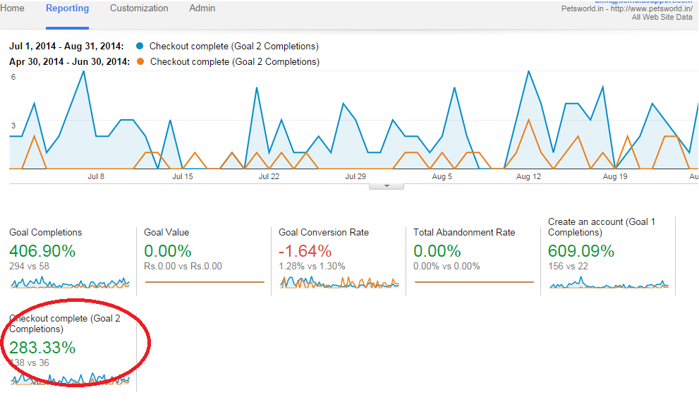
For one of my online marketing campaigns for an online pets shop, Pets World, I was able to successfully increase conversions by more than 200% in just 60 days simply by making some small changes in the landing pages design. This increase in sales is displayed by the below Google Analytics screenshot:
An impressive landing page should be able to catch the attention of visitors and binds them to complete the conversion. It is one of the essentials of driving successful leads to your website. Sounds amazing, but that’s the truth behind the need of an optimized landing page. A winning landing page will bring tremendous conversion rates to your website.
Here is an example of how an effective landing page must look like
If you want to achieve unparalleled success using a perfect digital marketing strategy, then you must know the essence of an impressive landing page. I am going to list down some vital tips that shouldn’t be ignored while thinking to implement an efficacious landing page on your website.
The overall design, look and feel of your landing page must have a huge impact on the mind of your visitors, then only it will be able to drive conversions for your website. The primary aim of your landing page should be inclined towards converting the traffic on your website to fruitful leads.
Hence, it is equally important that all the elements of your website must work towards conversion objectives, no matter whether it is related to filling a form, signing up a newsletter, making a purchase or downloading a PDF document.
Clean design means that it should have high-quality images with a clear background to compel the visitors to stay for a longer duration on your site, which will eventually improve your chances of generating revenues.
Here is an example of a clean and organized landing page design:
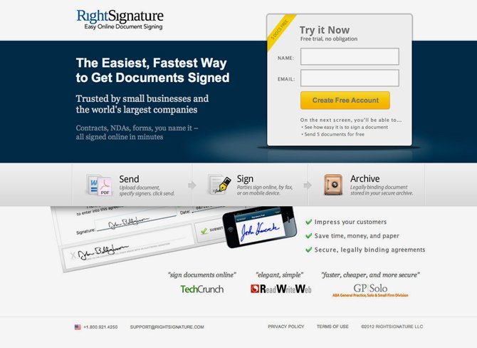
This a perfect example of a smart landing page as it has all elements that are required for improving conversion rates of a website.
A clean page with user friendly navigation and without any distractions is necessary to offer better user experience to the visitors. A good landing page should include all the information required for a compelling visitor to do extra for just visiting your website.
However, offering too much information can also irritate the visitors, so try to maintain a balance between the information and the graphics used on your landing page to ensure improved leads.
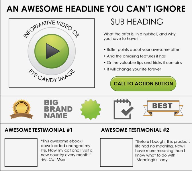
Take into consideration what key information should be displayed above the fold within the visitor’s direct line of vision. A good landing page must maintain clear and organized design while allowing visitors to access the information in an intrusive way. You can also use effective videos for offering more information to your visitors. Do not forget to highlight the key points that you are going to provide to your clients if they choose to subscribe to your services
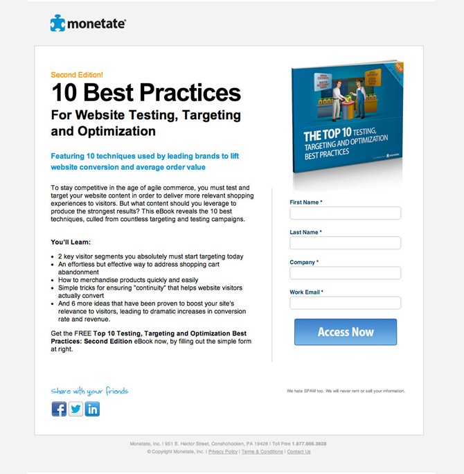
The above-shown landing page shows the key points that should motivate the visitors to buy this ebook. Moreover, the ebook has a professional design, which will definitely motivate the visitors to show their interest to know more about the content of this ebook.
A good landing must show a strong offer and also explain why this offer is important in concise and clear terms. Most of the impressive landing pages confirm their offers with the headline while they use the subheading for explaining their offer to share their value proposition.
I will cite an example to make this point more clear for my visitors:
Some landing pages prefer to push their value proportion to the main headline and use their subheading to discuss their actual offer. However, you must remember that you have only seconds to compel your visitor for making the final purchase.
Landing pages must include trust signals or badges for convincing the visitors that their brand and offers are trustworthy. Trust signals can be of different types, but testimonials are considered as the most effective type of trust signals as they reassure the visitors with the endorsement of their past client’s experiences.

You can also implement trust badges on your landing pages for generating trust among your visitors that your site is safe to carry for all types of transactions. Trust badges always refer to some reputed brands with whom you have worked in the past in the form of certain certifications or recognitions. They serve as an advertisement of your skills and trustworthiness.

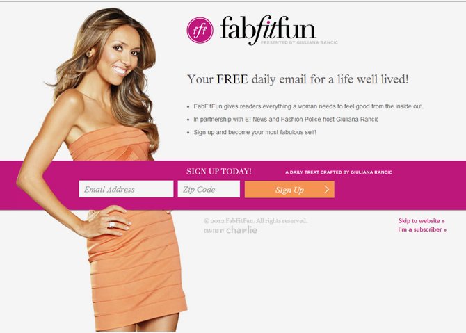
As an online marketer, you must want to collect more information from your visitor once he or she visits your website. However, when it comes to implementing an effective and optimized landing page, keeping your forms short is more important to save your traffic from moving away from your website without filling the form. If your form has lesser fields to be filled by the visitors, then there are greater chances that they will fill your form, but if it has more fields, then they might feel irritated and leave your site without filling the form.
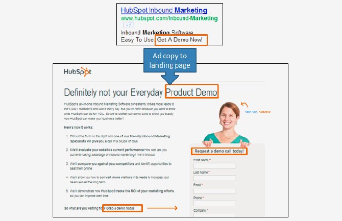
Always make sure to keep your messaging constant in both your call-to-action and headline of your landing page. If the visitor clicks on the CTA for catching a free offer and found that is only a catch to your landing page, you will surely lose their trust. Also, if the headline does not match with its corresponding CTA, it might lead to confusion.
Therefore, eliminate the chances of confusion or losing your visitor’s trust by including a matching headline with its corresponding CTA.
If you have an impressive offer and you are promoting it well, then you will likely be able to drive more traffic from different sources. Customize your landing pages as per the requirement of different audiences for better productivity through your online business.
You must know that a visitor who arrives at your website through Twitter or Facebook is quite different from a visitor who arrives your website through PPC. Therefore, tailor your landing pages to cater to the different needs of your individual visitors.
An effective landing page must match their page copy with the PPC ads displayed over them because repeating the same key phrases or language reassures visitors’ consistency and reliability.
It is equally important to offer visitors with the content they are looking for directly. If a user clicks a PPC ad on your landing page, don’t’s drive to another section because if you are able to match with your user requirement closely, then the chances of better conversion rate increase.
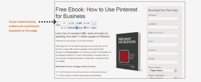
How can we forget the importance of social sharing when it comes to generating impressive revenue through your landing page? Always include social media sharing widgets to maximize your site’s chances of evangelizing your offers and content.
Only include those social media widgets, which are commonly used within your network. Even if your social contact doesn’t make a purchase from your site, but it improves the chances that someone will definitely make a purchase in their networks.
Digital marketing is not just about optimizing your website to increase its ranking in search results of popular search engines, but it also about how efficiently you have designed your website’s landing page so that the driven traffic on your site yields definite conversion rates. After all, the complete success of digital marketing depends on the perfect execution of ideas and thoughts.
Subscription Implies Consent To Our privacy Policy
7 Reasons Why Internet Marketing Is Important For Your Business
The 10 Advantages of Using WordPress for Developing Business Website